Sunday, May 31, 2009
Mythological creatures in our lives/Can you name this painting?
Update June 3: The painting on the left is the most recent (with special thanks to help from Pasadena Adjacent). I've re-painted a lot because changing the background made me also change the foreground and the girl's face and arm, especially, but some of the difference in colors is due to different light, today.
Original post:
I've painted further on Girl on a Cell Phone in response to some helpful in-person criticisms and reactions. As part of my response to the kind of blank reaction I got to the title and painting, I'm looking for a better title. Any suggestions?
Labels:
figure,
LA scene,
Oil painting,
urban landscape
Saturday, May 30, 2009
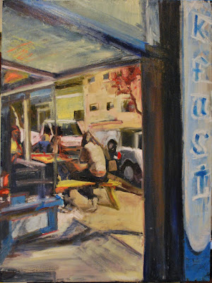
Discord on Green Street (work in progress)
This 20"x24" oil on canvas is one of the things I've been working on. This is painted from a photo I took recently on a warm night in Old Town Pasadena.
Labels:
LA scene,
Oil painting,
Pasadena street scene,
urban landscape
Friday, May 29, 2009
Portrait in Burnt Umber, and some thoughts on fugitive colors and Rembrandt
This is an 11"x14" oil sketch on canvas board, painted from life in 2008, in Anne Saitzyk's introductory painting class. We were limited to one color, burnt umber, which had to be painted fairly thickly and uniformly on the support. I actually painted the portrait into this by rubbing out paint with towels or fingers. There are a few places where I used a brush to get more darkness. (By the way, this is the same model as for Long May She Wave, but a much more realistic depiction.) This was a terrific exercise for me because it let me use the paint without needing to master using a brush at the same time.
This makes me think of fugitive colors. Something I learned at the materials seminar last Saturday is that Rembrandt used a palette loaded with fugitive colors (colors that fade badly over time). About half his palette were fugitive colors, so that there is no way for us to know what his paintings really looked like when fresh. Even partially faded, his portraits are amazingly compelling, and I feel lucky to have examples at hand to study, at the Norton Simon in Pasadena.
A few hours later: I made it over to the museum and spent some time looking hard at the Rembrandts. There were some places where it seemed very likely that colors had faded and changed, other areas that looked fresh and immediate, especially in his partially completed portrait of his young son and in his self-portrait painted during the prosperous times.
There are many, many other Rembrandt self-portraits in existence, including very moving ones painted during bad times at the end of his life (the one I've seen is at the Louvre). Taken together they are truly formidable and tell his story clearly. (You can find them easily on line at www.rembrandtpainting.net/rembrandt_self_portraits.htm .)
Later still: I've been reading the material at the above web page and it's fascinating. One very interesting term is "tronies," which describes certain "portrait" paintings that are not really portraits, in the sense that a tronie is not commissioned by a particular person, of a particular person. Instead, tronies are paintings, of exagerated expression, interesting types, the outlandish perhaps, which were made to be sold on the open market. Some apparently consider the Rembrandt self-portraits as tronies, useful to the artist as character and expression studies, popular and self-promoting as works of art.
Wednesday, May 27, 2009
Shopping for Vegetables and Breakfast at the Cricket Cafe, together
These are what I believe are the completed paintings.
On Shopping for Vegetables, I did considerable re-painting since the last post and completely changed the light. (Thanks, Cafe Pasadena.)
On Breakfast at the Cricket Cafe, I worked mainly on the sign, the female figure and the truck.
Some of last night's drawings
I finally made it to a live drawing session with my 18"x24" pad. These drawings are from close to the end of the approximately three hours of short poses.
The drawing of the foot is charcoal with some pastel; the others are charcoal. I used an eraser on the first and last drawings to bring up some light.
The middle drawing shows what my drawing looks like when I'm looking at the model and drawing without doing much checking of where the lines are landing on the page.
Note what the model is sitting on in the last drawing: some cloth and pillow over a sideways stool.
Monday, May 25, 2009
Huge improvement in working conditions
This beautiful new palette (the glass top) with shelves is precisely the right height for me when I'm painting. It's also on rollers that really roll, so I can move it around to where its needed.
The glass is great because I can scrape it clean, if needed (razor blade paint scraper), and also because I can get paint off of it and onto the support easily.
The shelving system underneath it works beautifully. It's a custom assemblage put together, on the spot, by an extremely helpful salesperson at the Container Store in Old Town Pasadena. Randy asked me about my purpose for the shelving and then designed this system that works beautifully for me--and then pulled the parts and put it all together right there--and took it out to the car. Of course, it's worlds better than my old system, a piece of glass on a too short trashcan, but it's also terrific, period.
Labels:
art technique,
essay,
palettes,
storage systems,
working conditions
Sunday, May 24, 2009
Shopping for Vegetables, in development
I painted this today, from a photo taken by Amanda Spitzer in January at the Wednesday Farmers Market in Santa Monica.
It's a 12"x16" oil on canvas, painted over another painting. It's not quite done, I think, but I need to stop and think about it before any more paint goes on.
Labels:
farmers market scene,
figure,
Oil painting,
portrait
Sad Woman
Sad Woman was drawn from life in 2008. It's on paper, about 15"x22."
I spent today at a workshop taught by Steven Saitzyk at Art Center College of Design. The topic was "Mastering Oil Painting," basically a tour through the materials and techniques oil painters use, with thoughtful and informed explanations for why things are done the way they are--and with recommendations for best and safest practices. This was enlightening in many respects and money well spent on my part because it provides a framework for analysis of future painting issues, as well as answering specific, immediate questions about safety, solvents, oils, paints, media, varnishes, and supports.
One question the workshop answered was whether it makes any significant difference to our environment to give up using pigments made from toxic metals. The short answer, I believe at this point, is no, if the paints are used responsibly. Additionally, because of the relatively short history of modern paints that do not use these toxic metals, while there may not be known problems with some of them, this does not mean they are not harmful. The bottom line, I think, is to use what works best for the particular application, but use it as carefully and responsibly as I can.
Labels:
art technique,
drawings,
environmental concerns,
essay,
materials,
portrait,
Tombow marker
Thursday, May 21, 2009
Three Oil Sketches from Life, 2008
These are oils on 12"x12" squares of cardboard. They were painted from life, in Ron Llanos' painting class at ACAN. Cardboard is a wonderfully soft and textured surface to paint on--and you can frequently get it for free. The obvious drawback is that it probably won't last as long as other supports, but I did gesso (prime) these cardboards before painting on them, so they are somewhat protected.
Labels:
art technique,
figure,
materials,
Oil painting,
painting exercises,
portrait
Monday, May 18, 2009
Breakfast at the Cricket Cafe (work in progress)
This oil on 30"x40" canvas is a painting I'm working on from my March visit to Portland, Oregon. The Cricket is a small cafe in the south east quadrant of the town, at Belmont and 32nd Ave., with really good breakfast (based on one visit, for breakfast).
What I've learned so far, from working on a larger scale, with this painting, Lorena and Flower Seller, is that I really should at least mark the canvas and the source photo into quadrants, so that I have some good idea of where things go. It's very easy for my eye to get lost in all the space and lose relationships between things. Marking quadrants sure would have made painting this much easier.
Saturday, May 16, 2009
Adding glazes and modifying Lorena 20"x24"
The portrait of Lorena finally got dry enough for me to try applying some glazes. I used M Graham's non-toxic walnut alkyd medium for oils, mixed with small amounts of paint.
Note: The top photo is of the eyes after I read pasadenaadjacent's comment and re-painted; the lower is of the askew eyes pasadenaadjacent commented upon. The last photo is of the whole portrait, as it now looks.
Woman
I think I said something like, I'm done for now, on the last post. But I wasn't. I think this is it, at least for a while.
Friday, May 15, 2009
Painting continues
This is the painting after a bit more work. I think I'm going to stop painting on it now and maybe try applying some glazes on areas to get some added depth and mystery (M Graham makes a non-toxic glazing medium for oils that I am eager to try out).
Painting begins
I'm working on a large oil painting of a cafe scene. As a diversion, I decided to paint from one of the drawings posted below. This is what I have, so far. I'm painting on a 16"x20" canvas; over another painting.
Note: This is not the large cafe scene I'm working on; this is the diversion from that work. (Clarification prompted after Cafe Pasadena's comment, in post above, and my re-reading of what I wrote.)
Tuesday, May 12, 2009
Some Charcoal Figure Drawings
These charcoal drawings, except for the portrait in the upper left, were done on18"x24" white paper. All were drawn from life. The portrait was drawn in NYC; the remainder in Mary Yanish's drawing class at ACAN, in 2007.
For all of these, I took charcoal dust, which I made by rubbing a piece of charcoal on a sandpaper block, and smeared it into blank paper. Then I drew with a stick or pencil of charcoal (or both). Then I used an eraser to draw light areas on the first two drawings, as well as the last.
P.S. I'm going to listen to myself (see comments) and drag myself and my paper and board out of the house and out to some uninstructed workshop with a live model as soon as possible. Though it's messy and often frustrating, this kind of drawing is just too much fun to give up.
Saturday, May 9, 2009
Exercises with the Zorn Palette
These are oil paintings on canvas, each 12"x16" and each done with the Zorn palette (except on the right, it looks like I may have picked up a little ultramarine blue at the end and put it on the hair and maybe some bits of cadmium yellow, also at the end), painted around 2006. The painting on the left is a self-portrait, done while staring in a mirror (and, no, I don't literally look like that, though I certainly painted what I felt at the time); the painting on the right is my version of a color copy of a work by an artist unknown to me. (This was an exercise from my then teacher, John Paul Thornton.)
The Zorn palette, named after a turn of the century (19th to 20th) Swedish painter, consists of white, ivory black, a yellow and a red (so I was told). I think I used yellow ocher and cadmium red, as my yellow and red on the copy of the unknown painting; I think I used alizarin crimson as my red on the self-portrait.
What you will quickly discover with this palette is that colors are relative. Your black and white mixes will look blue-ish, and your yellow and black mixes will look green-ish. If you take your black and white mix and mix it with your red, you will get something purple-ish, and so on. You can get a lot of beautiful colors from mixing these four colors in varying proportions.
In trying to re-construct when these were painted, I googled this wonderful artist, John Paul Thornton, whom I was lucky enough to learn from when he taught at the now closed Fine Artists Factory in Pasadena. His blog is aptly called Art and Courage; apparently he will have a book, available in June, also called Art and Courage. If you are interested in learning from a great teacher, I recommend checking it out. If it is anything like his in-person lessons, it will be well worth looking for.
Friday, May 8, 2009
Vancouver Farmers Market Paintings
These are the two paintings I've done so far that are about a recent spring
morning farmers market in the Pacific Northwest town of Vancouver, Washington.
If you've seen the earlier posts about Flower Seller, you know that painting an oil painting on such a large scale was a new experience for me. It was so big, I had to move it off the easel and prop it against a wall in order to finish painting it.
Wednesday, May 6, 2009
My 2008 student version of Gustave Courbet's Early Self-Portrait, aka "Is that Johnny Depp in fancy dress?"
Gustave Courbet painted his dramatic self-portrait very early in his career. My copy (from an 81/2"x10" reproduction of the original painting), posted here, is on cardboard in oil paint. The original is astonishingly good--and also astonishing because apparently Johnny Depp has a look-alike in another time and place. (Great jumping off place for a science fiction story).
As general matter, I learned a lot by copying the work of others. This (finding something you liked and copying it in grays in the same size as the original) was an assignment in Ron Llanos' painting class at Art Center at Night. (If you're curious about Ron's critique, he thought it was okay, except for the whites of the eyes, which I made too white. He was absolutely correct. I didn't go back and change the painting, so the error is still visible.)
Monday, May 4, 2009
Flower Seller (Work in Progress)
Okay. I heightened the colors and contrast in values in some areas, I made some marks with my white and dark oil sticks and with brushes and (some) with my fingers. I'm as done as I'm going to be, until I let it rest and re-evaluate. I'm thrilled and relieved to have painted on this larger scale, 30"x40". It was much more fun than I thought it would be.
Labels:
farmers market scene,
figure,
flowers,
Oil painting,
painting process,
portrait
Adding leaves and stems
I've added some leaves and stems. Now, it's time for lunch and then I get to take the dog to the vet.
Labels:
farmers market scene,
figure,
flowers,
Oil painting,
painting process,
portrait
Painting flowers
I'm really focusing on the large shapes. I'm also incorporating some of the purple-ish flower color into the rest of the painting.
I don't worry about getting the colors (that is, for example, pink, blue, yellow, green) accurately; I do work to get the values (the relative light and dark of the colors) accurately.
Labels:
farmers market scene,
figure,
flowers,
Oil painting,
painting process,
portrait
Getting Some Paint on the Canvas
After the initial sketch, I stopped for several hours. I was intimidated by the white space. Usually, if I am starting a fresh canvas, I start not with a sketch but by putting down an underpainting. Mine is usually some mix of paint colors that are dark. I tend to use paint colors that are less opaque, like ultramarine blue, alizarin crimson and Indian yellow, but really it's also just as often whatever I have the most of that is left over on the palette from my last painting. I apply it as fast as I can with the largest brush that I have and usually rub it with a paper towel so that it's uneven and very thin in places, so the white of the canvas shows through. Basically, I mess up the canvas deliberately, so that I can then be fearless about painting on it.
With this painting, I have titanium white, Naples yellow, azo yellow, transparent yellow iron oxide, naphthol red, anthraquinone red, alizarin crimson, ultramarine blue, manganese blue hue and olive green on my palette. I mixed the paint with a palette knife to get some more neutral colors, then used my three-inch hardware store brush first, then my two-inch hardware store brush, then an approximately one-inch flat hog bristle brush to apply this paint. (I changed brushes mostly so that I could paint quickly, without wiping off the brush in between.) I also used my dark oil bar to paint lines.
Labels:
farmers market scene,
figure,
flowers,
materials,
Oil painting,
painting process,
portrait
Sunday, May 3, 2009
Initial sketch
This is what I hope will be my second painting from my visit to the Vancouver, Washington farmers market.
I'm painting on a larger scale: this canvas is 30"x40." It's also a canvas that is fresh out of the wrapper (very unusual for me, since I tend to use and re-use my painting supports).
Anyway, since I actually had a white canvas to start, I decided to plan my painting directly on the canvas. I used my dark oil bar to lay down some lines that, while I will soon paint over them, at least give me some assurance that what I'm thinking of can fit well on the canvas.
My plan is to keep adding Flower Seller posts as I paint (this is this morning's work), until I either complete the painting or it morphs into something else.
Saturday, May 2, 2009
"Parallel Play" and "First Date" from my Sketchbooks
These are marker drawings from life, done at Spring Studio in 2008. The drawing on the left is approximately 5"x8", the drawings on the right are about 10"x10" each.
Strangely, the models in the drawing on the left actually posed together; on the right, they were in separate sessions, separated by a few days, but adjacent in my sketchbook.
Labels:
drawings,
figure,
portrait,
sketchbook,
Tombow marker
Subscribe to:
Posts (Atom)