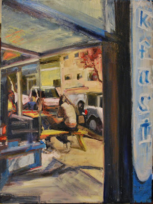
This oil on 30"x40" canvas is a painting I'm working on from my March visit to Portland, Oregon. The Cricket is a small cafe in the south east quadrant of the town, at Belmont and 32nd Ave., with really good breakfast (based on one visit, for breakfast).
What I've learned so far, from working on a larger scale, with this painting, Lorena and Flower Seller, is that I really should at least mark the canvas and the source photo into quadrants, so that I have some good idea of where things go. It's very easy for my eye to get lost in all the space and lose relationships between things. Marking quadrants sure would have made painting this much easier.

I tend to favor urban landscape painting over portraiture. This is beautifully composed with all lines converging on the hooded figure.
ReplyDeleteQuadrants or no, I really like this; compostiion, style, atmosphere, everything.
ReplyDeleteHi Jean,
ReplyDeleteI like the feel of this - great colors and composition, as has been pointed out. I like how the dark, vertical foreground element creates a psychological barrier. I feel this painting has a Hopper sort of mood to it - if you don't mind comparisons, and he's one of my favorites.
Thanks, all.
ReplyDeletePA, cool. I didn't know I was painting a landscape--I like "urban landscape."
K--Yes, I thought of quadrants because of how Portland is naturally divided by water, but for someone like me, who hates to measure, eyeballing halves is doable and relatively painless.
Katherine, what this strongly reminds me of (after the fact) is of Alfred Hitchcock's storyboarding--something like Rear Window, where there is a story happening in the distance, which is strongly framed. You kind of expect to step through and into it.
JS, you just need to start working back here in our Cafes!
ReplyDeleteThose colors are just lovely. (Initially I thought this was the joint on Walnut and El Molino.)
ReplyDeleteOkay, CP and AH. There's plenty to love--and paint--in our neck of the woods, and I hope to paint some of it.
ReplyDeleteHopper on hallucinogens!
ReplyDeleteYour right; it's because of the pigments I used. They tend not to gray down as you mix them, much less graying than with the cadmiums. I had to work really hard to get any graying at all. I kind of love this palette. It's kind of late 20th-early 21st century in look.
ReplyDeleteThis comment has been removed by the author.
ReplyDelete